True Believers Retro Character Collection #1, Spider-Man Pop-Up Book
Background
This new offering is far from being the first Spider-Man Pop-Up book. In 1980 had Spider-Man: Piccolo Pop-Up Book and 1982 saw Amazing Spider-Man Pop-Up Book "The Schemer Strikes". More recently there was a series of four Pop-Up books produced by Paradise Books (see Paradise Books: Spider-Man Pop-Up for details).
This offering from Candlewick Press is supposedly the first in a series of Marvel Classic Pop-Up books. If this one sells well, I guess we'll see at least an X-Men and a Fantastic Four offering, and maybe more.
Story 'Spider-Man Tastic!'
True Believers Retro Character Collection #1, Spider-Man Pop-Up Book
| Publisher: | Candlewick Press |
| Editor: | Caroline Repchuk |
| Paper Engineering: | Andy Mansfield |
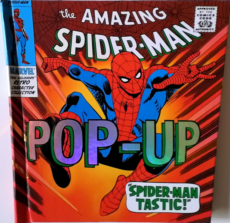
I love pop-up books. In an age of high-tech computer games, it's fantastic to see that this ancient technology can still make a splash in the market. A well-crafted pop-up is a true joy to behold. This one truly attempts to make itself distinctive by eschewing a simple rectangular format in favor of a trapezoidal form. It's 10" tall and 10" wide at the top, tapering to under 8" at the base.
This book is 1.5" deep. Perhaps deeper than strictly necessary to accommodate the contents, even with the thick card machinery for the pop-ups and the thick cardboard cover. The excessive depth gives it the feel of a loose leaf binder rather than a book. The cover is suitably retro in feel, though the silver foil on the text of "POP-UP" is hardly a feature of the sixties.
The first pop-up spread features Spider-Man (with silver reflective eyes) leaping out of the page. A couple of descriptive text balloons are built into the pop-up. On the side, there's a page from Amazing Fantasy #15, which is also a fold-up flap that opens onto a second page from that comic, with a pop-up "radiation effect" surrounding the glowing spider. Furthermore, there's a couple of "pull-out" tags that display additional "Fact File" information.
The second spread is the Green Goblin, on a silver reflective glider. A small Spidey is in the background, with a piece of string attached to an overhang which is raised a little from the page. The background of half the page again consists of panels, this time from Amazing Spider-Man #40, the origin of Norman's powers.
Spread three is a pop-out Doctor Octopus with Spidey gripped in his silver tentacles. The text panel at the top is also popout. The left background is panels from Amazing Spider-Man #3 and the right hand side features more panels with other foldout panels from Amazing Fantasy #15, Spidey's attempt to make money as a wrestler. There's a Spidey shooting webbing which moves when you open the fold-out. Pull-out fact files as normal.
Next spread is the Vulture. There's three panels which aren't so much pop-up as raised segments drawn on card and half-glued to the page, so they sort of sit a little above the page, but don't really pop-up in the traditional sense. There's more panels, from Amazing Spider-Man #2 naturally. Pullout fact file, big text "Vulture" heading which is cut-out on card and moves a little. Random bits of silver are here and there.
Repeat again for Electro, Kraven, Sandman and Mysterio. They're all in a similar vein, splashes of silver, lots of panels and big text form part of the pop-up. Pull-out fact files on every page.
General Comments
There's no shortage of cut-out and pop-up action in this book. Rather, there's too much of it. What's more, there's so much material crammed on each page with big text headings, panels, pull-outs, shiny silver bits, the overall effect of each spread is just one huge mess. The impact of the central pop-up on each page is diminished by the surrounding cruft. There's a violently contrasting mix of colors on each page, and a ton of detail.
The pop-ups themselves are not particularly imaginative, and it's quite hard to get a good effect from them. The way the book is constructed, it's not really possible to open each page properly flat without fearing to risk tearing the construction, so you end up getting the page three quarters open, and then peering in trying to get the right angle to maximise the visual impact.
Also, while the content, panels and villains are well chosen to match the "retro" theme, the colors used are hardly the understated tones of the era, they're more reminiscent of the excesses of the late eighties and early nineties with their over-saturated hues and their silver holo-effect on anything that stood still long enough to receive it.
This results in a book which is kind of confused in its target market. It's "retro" on the cover, and carries a US$25 price tag. Furthermore it's fragile enough to not really be suited to smaller kids (I found a few of the pop-ups had to be carefully tweaked before they would even work). That means that it seems kind of suited to the 40-somethings market with a bit of cash and a desire to rekindle some childhood memories.
However, the interior doesn't satisfy on that level. The pop-ups suffer from modern excess and modern shallowness, they have modern overwhelming colors and suffer from the data overload which is the sign of our modern times.
Overall Rating 

No pop-up book is ever going to receive a below average rating from me. I love the whole concept too much to really sink the boot in to this book, despite its weaknesses. However, this book shows that complex cut-out and constructions and silver sparkle is no substitute for well-considered design and a little restraint.
This book isn't exactly "full of sound and fury; signifying nothing", but it certainly does guild the lily. I much prefer my pop-up books to have a single, clear, well-constructed layout on each page, with background colors and layout that support the major work, not detract and distract from it.
Three and a half webs for this enthusiastic but ultimately unsatisfying offering.