Marvel Super Heroes vs. Villains: An Explosive Pop-Up of Rivalries
Background
This is a deluxe pop-up book from Jumping Jack Press in 2012. Sized at 9" x 9" x 1.5" and containing eight pop-up scenes, it carries a hefty $35 price tag. Let's take a look inside.
Story Details
Marvel Super Heroes vs. Villains: An Explosive Pop-Up of Rivalries
| Publisher: | Jumping Jack Press |
| Editor: | George White |
| Artist: | Alex Ross, Amanda Conner, Christian Nauck, Dave Dorman, Greg Horn, Jim Lee, Joe Jusko, Leinel Yu |
| Designer: | Monika Brandrup, Yevgeniya Yeretskaya |
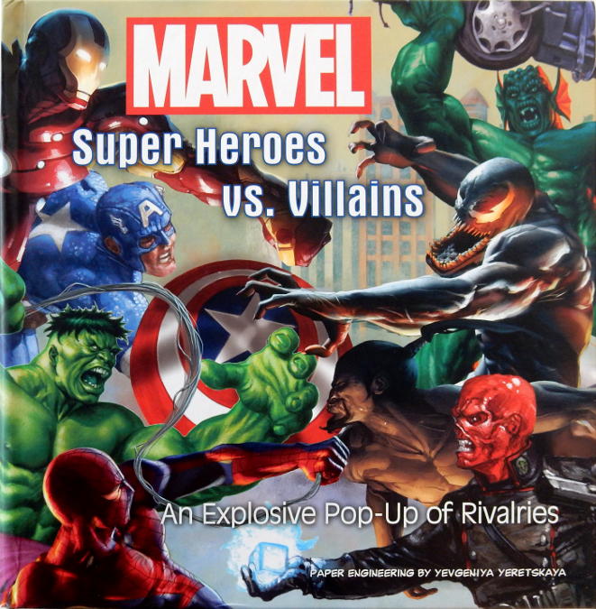
As soon as you open the first scene (Spider-Man vs. Venom) you'll see exactly why the sticker says "thirty-five bucks". The multi-layer paper-construction climbs out of the book and into your face as the scene expands upwards. Four, five, six cardboard elements carefully unfold themselves as you open the covers.
All in all there are eight scenes:
- Spider-Man vs. Venom
- Iron Man vs. Mandarin
- Fantastic Four vs. Doctor Doom
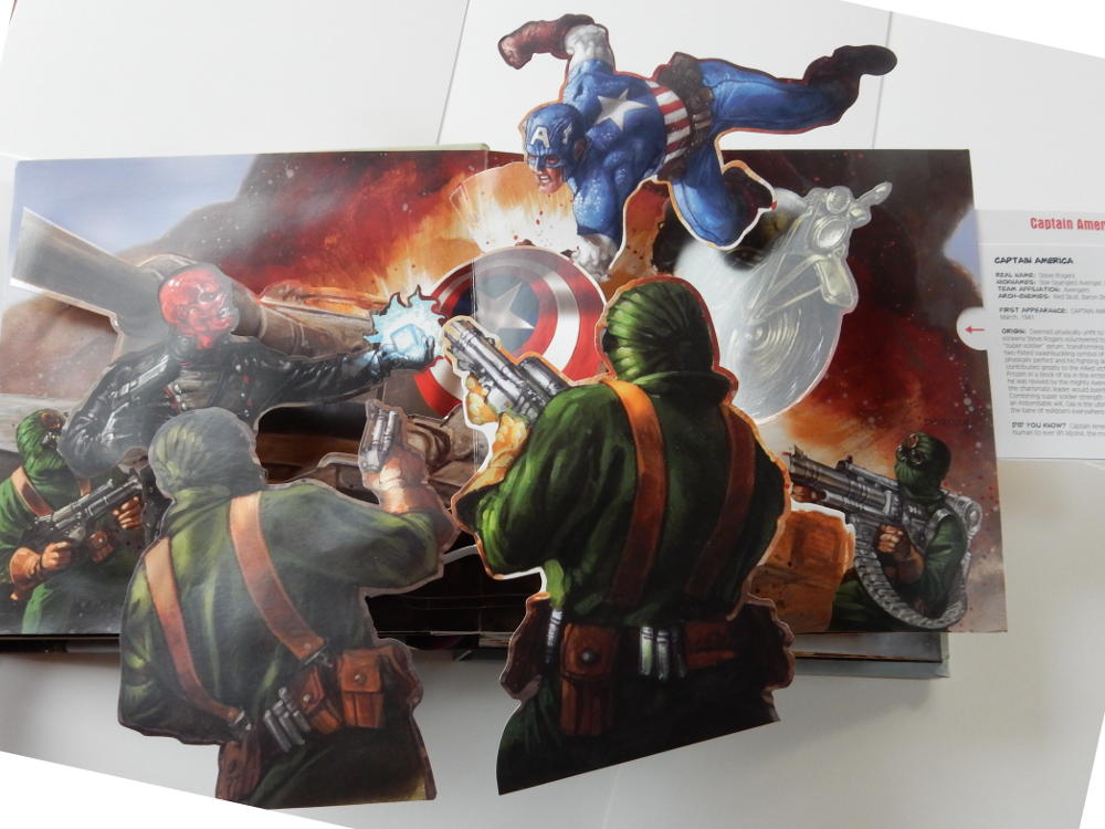
- Captain America vs. Red Skull
- Hulk vs. Abomination
- Thor vs. Loki
- X-Men vs. Magneto
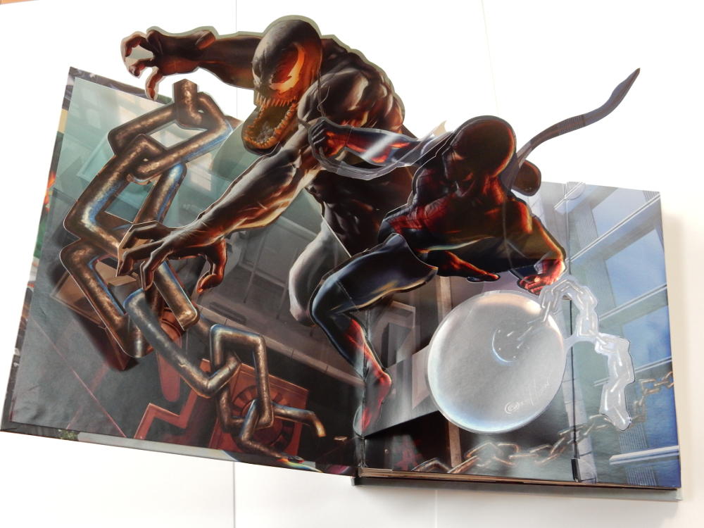
- Wolverine vs. Sabretooth
The all-original artwork is top-notch too, which isn't at all surprising once you look at who was involved. Alex Ross, Amanda Conner, Christian Nauck, Dave Dorman, Greg Horn, Jim Lee, Joe Jusko, Leinel Yu. These are the big names from Marvel's top-notch artist roster. The colours and tones vary from scene to scene. Venom is dark and moody. By contrast, Thor's Asagard with rainbow bridge is bright and bold.
Detailed Comments: Spider-Man vs. Venom is simple but powerful.
Wolverine vs. Sabretooth actually doesn't feature Sabretooth at all in the pop-up! But the giant off-the-page Wolverine is impressive enough all by himself.
Captain America vs. Red Skull and Hydra is superb. The scene fills the whole book, and then overflows out of the top and the bottom as Captain America abandons his motorcycle and the battle rages out of control.
Hulk vs. Abomination has a nice touch... The Abomination rises out from behind a pile of scrap, holding a car in his hands.
Iron Man vs. Mandarin is a simple stand-up scene which focuses on the two main characters. It is light on background detail, dark on mood.
The Fantastic Four vs. Doctor Doom is perhaps my least favourite. Despite a significant amount of construction, it doesn't do much at all. It has multiple layers, but they all pack close to the base page with very little pop-up in any direction. Lots of cardboard, but I'm really not sure what it's trying to achieve.
Thor vs. Loki is a nice, classic stand-up scene. Characters in the front, buildings of Asagard in the back, straight-forward and effective.
Finally, X-Men vs. Magento takes that basic stand-up concept and extends it further, nesting stand-up components eight layers deep! It adds a secondary stand-up segment which actually need to be raised by hand (rather than raising automatically when you open the page). That makes it the most complicated of all the scenes — possibly verging on the point of losing effectiveness through excessive complexity.
General Comments
Pop-up technology hasn't changed a great deal in the last hundred years. But insomuch as there is a "state-of-the-art", this book contains several examples of it.
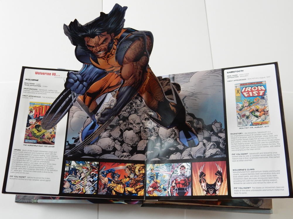
If I was to make one negative comment, it would be that many of the scenes have information panels or pull-out tabs, giving you a bit of origin info about the characters, battles, or the comics from which they are drawn. But I wonder if in fact the book wouldn't have been better without the distraction of this extra detail. The scenes speak eloquently all by themselves.
Overall Rating 

Overall, this is superb work by designers Monika Brandrup, Yevgeniya Yeretskaya. I'm a fan of pop-up books in general, and it's great to see that the genre is alive and well.
Four-and-a-Half Webs.