The Art of Marvel (Vol. 2)
Background
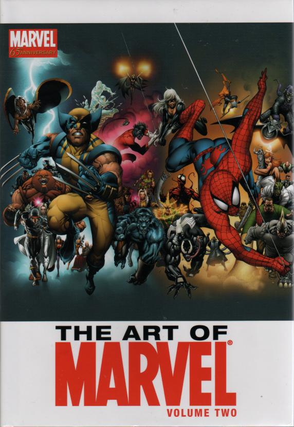
This 2004 edition is the companion volume to The Art of Marvel (Vol. 1) from the preceding year. Neither should be confused with the 2000 Marvel Art collection entitled simple The Art of Marvel Comics. The Vol.1 and Vol.2 books are 7.5" x 11" - the standard sizing for Marvel's recent book publications. Both are 128pp with glossy paper.
Story Details
The unnumbered 2000 volume featured art arranged by creator. The 2003 Vol. 1 grouped by character. Struggling with the fact that most of the best art has already been used, Vol. 2 decides to sort art by decade, thus giving an excuse to dig further back into the archives. Hence the chapters of this collection are simply "The 60's", "The 70's", "The 80's", "The 90's" and "Today".
Unfortunately, most of the 60's original art is no longer available, so we have to settle for reproductions. Even worse, the reproductions seem to have been manually re-colored based on poorly reproduced line art. To somehow "compensate" for this, the art has been squeezed onto the page with no framing, in fact often overflowing the pages leaving the image amateurishly cropped. Annotations are restricted to names and dates, panel art is mixed with cover art in whatever arrangement best fills the page with blocks of garish color. The overall effect is painfully overbearing. Any pleasing aesthetic quality that this classic art once had is lost in the poor reproduction and insensitive layout.
The quality of the raw material clearly improves as we move through the decades, so by the time we reach "Today", the actual art has regained much of it's appeal, though the layout is still very disappointing. It also starts to encounter the problem that the best art of the past few years has already appeared in the preceding two "Marvel Art" collections - though to be fair, Marvel has a lot of great art talent working very hard, and there is always a steady stream of new stuff on tap.
General Comments
For a $30 price tag on a 128 page book, you would expect a "deluxe" look and feel. Instead, this volume is as classy as a ten-dollar hooker. A photographic reproduction would have been much more effective for the early work. The color saturation levels should have been cranked right back too. And as for the framing on the page...? Well, what framing? Shoving these classic masterpieces by Kirby and friends into the reader's face does them no justice at all. They deserve more respect than that - a strong black border, high quality natural colors. Not this amateurish paste-up job.
Overall Rating 
A huge disappointment after having awarded five webs to Vol. 1, but we can't give this shonky follow-up more than two webs at most.